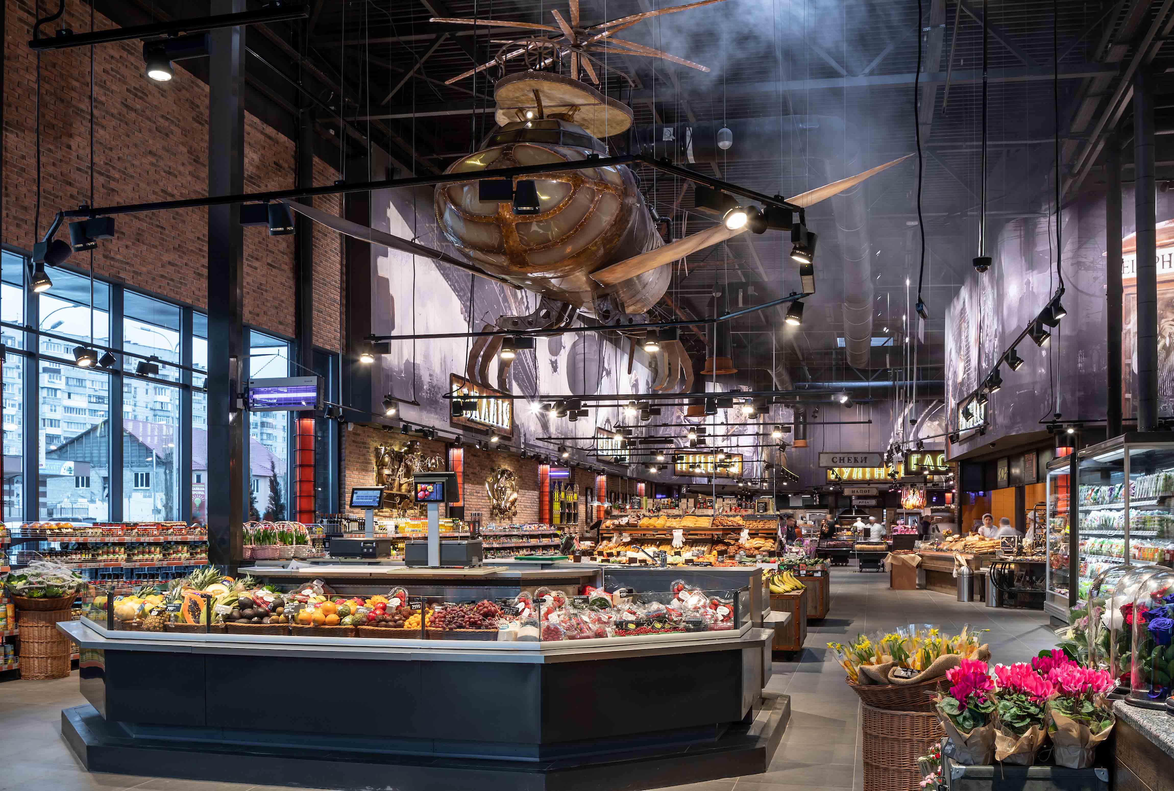
An amazing shopping experience every time: this is the strategy of Silpo, a successful supermarket chain in the Ukraine. The brand currently operates more than 240 supermarkets in 60 towns and cities and, since its foundation in 2001, it has repeatedly caused a stir in the sector with its original and unconventional store design concepts. New supermarkets are given elaborate, individual designs on themes ranging from "Japanese manga" to "rock music" or, like in Wyschgorod near Kiev, "steampunk". The ambience and atmosphere in the supermarket are derived from the leitmotif – from the colour scheme and decoration to lighting and signage. In this way Silpo creates an impressive shopping experience that encourages customers to identify with "their" supermarket.
An insight into the world of steampunk aesthetics
"Steampunk" is a style with subcultural roots that is oriented to the future visions of the era of Jules Verne: retro-futuristic and fantastic, harking back to the era of steam power and mechanics. For the lighting, Silpo's in-house retail design team worked closely with BÄRO's lighting consultants. The lighting concept supports the intensive atmosphere in the store, emphasises the elaborate decorative objects and at the same time ensures a differentiated, attractive product presentation. Wall and ceiling surfaces are dark for a stage-like presentation of the store. The fixtures and furniture that also come in dark colours create a neutral background for the expressive store design.
Light supports the presentation
The infrastructure is provided by black tracks that are suspended or mounted on plasterboard ceilings. Equipped with BÄRO Ontero EC and XR spotlights with coordinated light distribution patterns, they form a highly flexible and energy-efficient system with functional, atmospheric and showcasing lighting components – supplemented by decorative luminaires in an industrial look that add to the atmosphere. Brilliant, targeted light brings the metallic surfaces of the fanciful decorative objects to life and the graphically designed wall surfaces are evenly flooded with light. Silpo uses product-specific light colours for product lighting, for example Sun for the rich, warm colours of fruit and vegetables, Meat&Fish to provide an optimum impression of freshness in the fish department, GoldenBread for appetising bakery products or the classic SpecialMeat for the meat and cold cuts counter.
https://silpo.ua
Principal: Silpo / Fozzy Group, Kiev (UA)
Interior design and light planning: Silpo store design team


